The Case for Comic Sans
20:37
There are some things that I adored as an eight-year-old that have stood the test of time. Tom and Jerry cartoons, the Artemis Fowl book series, Wispa chocolate, and prodding my younger sister in the arm while making strange bleating noises are just some of the entries in a list of childhood loves for which my affection has not diminished at age twenty-two. Sadly, but not unexpectedly, this list is fairly limited. Eight-year-olds don't generally have very discerning taste. Nothing sums this truism up more effectively, I feel, than the Comic Sans typeface.
Ah, Comic Sans. We used it on every poster we ever made at primary school, and then we grew into adults who love to hate it even more than we do Katie Hopkins. When searching for an example of a terrible typeface, Comic Sans has become the clichéd example. If you use it you open yourself up to merciless ridicule, and the God-among-men that is Charlie Brooker has threatened you with assault. There's even a tongue-in-cheek but ultimately real online campaign to have it banned. So despised is this font that I can't even use it as an option on my blog.
I don't like Comic Sans, but neither do I hate it, and the fact that many people consider it the world's worst typeface has caused me amusement and mild confusion for some time now. It's certainly not the least legible font; that award goes to the ridiculous 'script' fonts designed to look like handwriting that no one who grew up outside of a Renaissance monastery has ever had, or ones that have hair. I have asked Comic Sans-hating acquaintances to rationalise their hatred, and the answer I get almost always references the font's ubiquity. People use Comic Sans when it's just not appropriate, they say, and seeing a badly placed font on a regular basis leads to loathing.
As with so many criminally misused fonts, the clue to what Comic Sans is best used for is in its name. For the benefit of those who are especially slow on the uptake, the typeface was created for use in comics – specifically in speech bubbles. It was never meant to be used for blocks of text, or even large, bold headings. It was an understated, informal font that served a very particular purpose, and did so perfectly adequately. But, as happens with so many adequate things, we've ruined it. We ruined it by putting it on poorly designed websites. We ruined it by putting it on posters. Someone even ruined it by putting it on an ambulance. If the choice was between dying from a lack of adequate medical attention and getting into that ambulance…I'd obviously pick the ambulance. I'm not a moron. But I wouldn't be happy about it.
Comic Sans is not the only font to fall victim to poor usage. The Windows classic Times New Roman is another font that is frequently used for purposes that it was not designed for and does not suit. The fact that it is named for The Times newspaper appears to have passed many people by. In print, Times works well in the small, compact columns of a broadsheet newspaper, and very few places else. If you aren't clued-up on fonts (quite frankly, if you don't work in publishing or graphic design I sincerely hope that you aren't) you may have assumed that most books are printed in Times. After all, it's the 'default' serif font, and most neurologically typical people don't care enough to bother examining the difference between Garamond and Bembo. If there are huge spaces between words and the letters look uncomfortably close together, you've been reading Times, and a book that has been badly typeset. Since joining the world of book publishing eight months ago, large blocks of text in Times New Roman make my head ache, my eyes slide out of focus, and my hands curl into misshapen claws.
Times New Roman serves its purpose (well, it did – it's been gradually phased out by The Times in favour of slicker iterations, starting in the early '70s). We recognise that it has a place, even though we're all sick to death of seeing it used in essays. So why don't we afford Comic Sans the same leeway? Why do we heap our scorn upon the typeface rather than the people who think using it on their company website is a good idea? We don't take this attitude in other areas of life. Let's look at a household object with one intended use, such as a toothbrush. The toothbrush was designed for one thing: cleaning a certain part of the inside of your mouth. Assuming you've bought a decent one – and I trust that anyone with enough taste to follow this blog is willing to put a little money towards upholding meticulous standards of oral hygiene – it does this job very well. It's ergonomically designed for this purpose alone.
With this in mind, imagine your reaction if someone were to come to you and say, "This toothbrush is terrible. I tried to polish the tiles on my roof with it yesterday, and it took hours and hours, and by the time I had finished the brush had worn out completely! Toothbrushes are just terrible. I am going to pass judgement on anyone who uses them."
Any moderately intelligent person would respond to this with, "Wow, what an idiot, using their toothbrush for a purpose that it was clearly not meant for nor suited to." Why should this be different for typefaces? When presented with a poster made with Comic Sans, why is our reaction not 'what a typography-ignorant moron' but 'Euurrrgh Comic Sans'?
However, I have wasted my time, because all of this is irrelevant. It would be perfectly reasonable for me to delete everything written up to this point, because it is simply not necessary. For, you see, there is a far more compelling argument for leaving Comic Sans alone. It is the existence of something far worse, something far worthier of mass hatred. It is the existence of this:

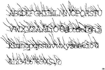
Look at this. Look at this disgraceful mess.

Gaze upon its misshapen form. Follow the uneven lines of the letters until they become inexplicable, dizzying swirls. Look at the place above the I where you would expect a dot, and instead get the spiralling pendulum of a particularly enraging hypnotist.
If your eyes haven't fallen out of your head in a desperate bid for a release from the torture that you are currently inflicting upon them, try it in all caps.

There is so salvation. There is no God.
This typographical tragedy is Curlz, and it is not only the worst font to ever exist, but one of the worst things to ever exist. It's up there with tsunamis, Hitler, and Ireland's 2008 Eurovision entry. It is a disgrace. It is a scourge. It is an act of violence against the optic nerves and photoreceptors, and against common decency.
The most upsetting thing is that this wasn't an accident. Most of the time, sights this horrific are caused by freak incidents of nature that humankind is powerless to influence. But not Curlz. Curlz happened on purpose. This was knowingly and intentionally inflicted upon the world. It staggers me daily that Agfa Monotype have not been hauled before the United Nations and forced to pay for their crimes against humanity, but ours is a random and unjust world.
There is nothing good about Curlz. Not content with merely being ugly and tacky, it is also difficult to read. Comic Sans may be unappealing outside of one very niche setting, but at least it's legible. Trying to read a sentence in Curlz makes me feel dizzy and irritable. I strongly suspect that whoever commissioned Curlz was aiming to make printed letters 'cute and feminine', and then hired a designer who had never had any contact with an actual woman. And then said designer had a nervous breakdown. Mark my words; this font is the product of a mind in crisis.
Curlz was allegedly created for use on party invitations, and let me state clearly and unapologetically that any invitation I ever receive set in Curlz will be immediately and impolitely declined. If you're the sort of person who thinks it is in any way OK to use Curlz on an invitation then I would rather have a three-day migraine than go to your party.
There is only one acceptable use of Curlz and that is for revenge. If I ever feel that you have wronged me deeply you can expect all communications from me to be in Curlz until you either apologise to me or go blind.
So, people of the world – or, at least, the six or seven who read my blog – hear my message. We need to stop the abuse of Comic Sans. We need to let this typeface fall into the obscurity it was meant for, for this petty squabble distracts us from the true evil that lies in our word-processing programs. Let us focus our anger, our pain, our hateful energy on a worthier foe. Together we can put an end to the ocular WMD that is Curlz once and for all.


0 comments